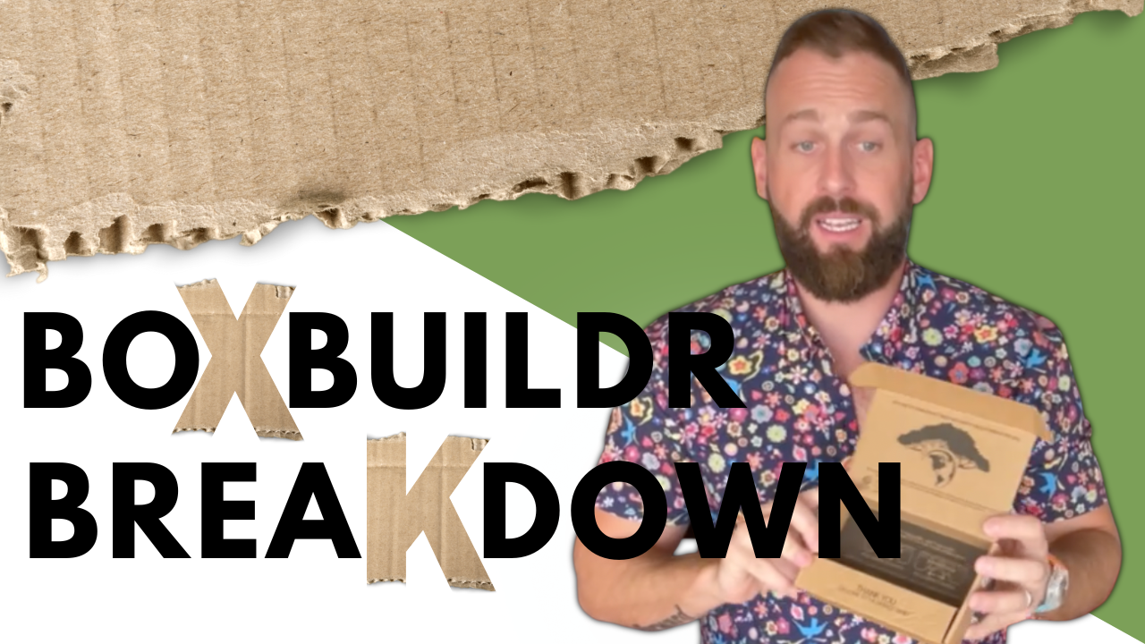
On this Special Edition of Boxbuildr Breakdown, Jeremy and our Boxbuildr in training are unboxing Earth Fed Muscle! Earth Fed Muscle uses their branding to stand out in the space and communicate their brand's personality to their customers.
All tagged Unboxing
BoxBuildr Breakdown - Good Times
This time on Boxbuildr Breakdown, Jeremy is unboxing Good Time soaps. Good Time made intentional choices with their print that elevate the branding while keeping costs low with 1 color flexo print on both sides.
BoxBuildr Breakdown - Unboxing Last Crumb
This is one of our favorite unboxings so far! Luxury cookies deserve a luxury packaging experience. Last Crumb uses a digitally printed OPF shipping shell with rigid set up secondary packaging. This unboxing hits all the marks: spot gloss, foil, and matte black!
BoxBuildr Breakdown - DTC Fragrance Packaging
Glass primary packaging presents a few challenges for Direct to Consumer brands. Hawthorn uses rigid setup with an injection molded tray to provide a high level of protection. Their premium add ons elevate the branding and the kit looks great as a complete set.
BoxBuildr Breakdown - Debossing and 1 Color on Kraft
Ombraz is doing a lot of things right! Their inner packaging incorporates some of the best style options available without sacrificing sustainability.
BoxBuildr Breakdown - DTC Sauces and Seasonings
Omsom uses a corrugated shipper and a high impact folding carton inner to create a powerful, branded experience delivered right to their customer’s homes. Tune in to learn more about SBS folding carton for DTC food brands. Plus, learn about the print capabilities folding carton can offer your brand.
BoxBuildr Breakdown - DTC Beverage Unboxing
Another mystery box! Spoiler alert, it’s Pop & Bottle’s 8oz Sleek 6pk. This DTC option was fulfilled by Amazon using retail designed packaging. Tune in see experience the customer journey for this type of DTC fulfillment and decide if it’s the right choice for your brand.
BoxBuildr Breakdown - 10lbs Of Beef Jerky!
This time on Boxbuildr Breakdown, Jeremy gives us some insight into using stock Uline boxes as opposed to custom solutions. Tune in to learn more about using stock solutions and watch Jeremy try to find some nice words for bubble wrap.
BoxBuildr Breakdown - Snack Magic
In this episode of BoxBuildr Breakdown, Jeremy unboxes Snack Magic. This box is a great example of structural and graphic design working together to keep impact high and costs low! Plus, Snack Magic uses some clever hacks to add personalized messages to their customers in the late stages of the pipeline.
BoxBuildr Breakdown - Unboxing Magic Spoon
In this episode of The BoxBuilder Breakdown, Jeremy gets to relive some childhood nostalgia AND give us all some pointers on how to make lower cost print options look like a million bucks. Here’s what you can learn more about in this video:


